08. Derya Yonten, Lyah Scott-Flanagan, Emma Nwachuku, Ola Murray from 283goswell on Vimeo.
Friday, 24 May 2013
Friday, 1 February 2013
Thursday, 31 January 2013
Evaluation: Question 4
Evaluation: Question 1
My final media product has a lot of generic media
conventions. In relation to Laura Mulvey we used dismemberment, which is
featured in the start of our video. We
had a close up of our artist’s face, chest and behind. We did this to attract a
wider male audience and to add a convention which is featured throughout pop
videos, with artists such as Rihanna and Britney using dismemberment a lot in
there videos. The Male Gaze is
featured quite a lot in modern music videos, which relates to the ‘male
dominated world’ that Laura Mulvey describes. I was mostly influenced by the
idea of the male gaze by Rihanna’s video for Rude Boy. Within this video, Rihanna is barely dressed
whereas the male dances are appropriately dressed. Also, the choreography was
designed to show Rihanna as very sexual towards men rather than the other way
round. One can argue that this emphasises male dominance in relationships.
In
connection to Cara Vernallis we used special effects such as Slow and Fast Motion, Reverse, Motion
Blur, Equalize, Colour Correction and Light
Rays.
We used this as our original footage was quite dull and
would bore the audience. We used Light
Rays on the footage with our lead artist in Lee Valley; this was due to
weather on the day of filming as it was cold, and raining. The Light Rays created a lighter and magical
tone to the clip. We also used Colour Correction a lot, as we discovered that
the footage taken in Banksy Tunnel was quite dark we used the Colour Correction
tool to correct the brightness. I also edited two other clips: one with Lyah on
the steps at Regents Canal, which I colour corrected so that the clip became
purple. I then converted a clip of lyah in lee valley to black and white. We
also added text to our music video; this was to engage the audience more as
they could sing along with the artist. We wrote in Bubblegum font as it was big and animated which worked together
with the general tone of the video. We used colours such as yellow, blue and
green as they are bright and attractive. Vernallis also mentions continuity
editing, which featured a lot in our video, we had a range of shots but we kept
going back to them, so that the video wouldn’t become difficult to follow.
I decided to use special effects because I watched Outkast's Hey Ya which featured alot of special effects for example, The lead artist was the whole band.
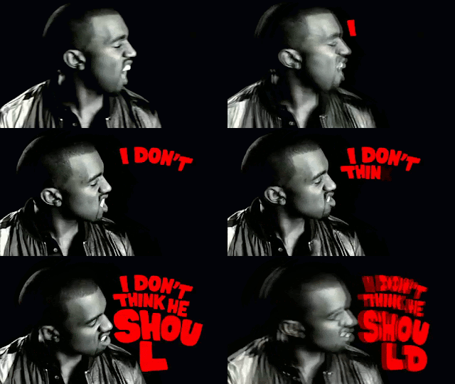
Kanye West’s video for The
Good Life, inspired me to use text in our video because it brought life to
what would have been a very plain video. The text was similar to the font used
in our video as it was big and bright and caught the audience’s attention.We related to Andrew Goodwin,
because our music video was an example of Disjuncture
because our video is autonomous from the song lyrics. Because our video had
no connection to lyrics this meant that our creativity wasn’t hindered and we
were allowed to produce a completely different video from the lyrics.
We did challenge pop conventions as we used hip- hop dancers
in our video; to make the clip go along with our song we used slow motion. We
decided to add the dancers because we wanted the video to have a variety of
people and we also needed a filler to keep the audience interested, from
watching the final piece at the Screen on
the Green I think that the dancers were well received as it was unexpected
of a video in this certain genre. We also used an animal in our video because
we thought that it would add a playful and care-free tone to our video, I was
partially inspired by Beyonce’s video for Run
the World (Girls) because it had a large focus on powerful animals. I
decided to use this theme but in completely different way because young
audiences particularly relate to animals.
In regards to our ancillary print
products I think they are very conventional, I was influenced mainly by the
advert for Madonna’s MDNA album, I thought it was simple without being to plain
and easy to emulate. I included the
artist’s, name, URL and record company. I also included the release date,
reviews, and the availability. I think my poster is very straightforward and
conventional whereas my album is very loud and attractive. I used space as a
running theme because I believe that with pop artists there isn’t any limits,
whereas with other genres such as rock, indie and hip hop colours, themes and
tones are quite limited and similar.
Overall I think that Intersexuality
was a big theme in our video, other videos in our genre e.g. Marina and the
Diamonds video for Oh No as it featured a lot of colour and locations. Our
final product has challenged and conformed to conventions which helped us to
create an entertaining and exciting video.
Subscribe to:
Posts (Atom)


