08. Derya Yonten, Lyah Scott-Flanagan, Emma Nwachuku, Ola Murray from 283goswell on Vimeo.

Showing posts with label Derya Yonten. Show all posts
Showing posts with label Derya Yonten. Show all posts
Friday, 24 May 2013

Friday, 1 February 2013
Thursday, 31 January 2013
Tuesday, 29 January 2013
Evaluation: screen shot

This is when I finally figured out how to set up Camtasia. I had trouble trying to get the microphone working, and needed help. But once that was done, I recorded the screen and spoke over it.
Monday, 28 January 2013
Tuesday, 22 January 2013
Evaluation- ideas


I had to go back to our final music video on Final Cut Pro, and write down the names of all the effects we had used, since we needed to know what they were for our evaluation.
Question 1 evaluation spider diagram

This is just a quick spider diagram of what I would write for Question 1 of the Evaluation. I just touched up on the main points I will be talking about, like Goodwin and Mulvey's ideas on music videos.
Another thing I forgot to write was the locations. In our video, we had a different locations, which goes along with the conventions of pop videos.
Sunday, 20 January 2013
Thursday, 17 January 2013

PLANNING: Digipack review
I finally finished my digipack, and I actually like the final finished look of it. I kept it plain and simple by having a continuous colour theme of gray, black and white. Eventhough these are kind of dark colours, its all about the images that are present in the digipack. They show the fun side of our artist, Luna Smalls, by her doing different actions, smiling/laughing etc. I kept the font the same too, which was called Raja Drama. I had the name of our artist in bold, underlines and bigger in size compared to the title of the song, which was called 'Skinny Genes'. As you can see, there is only the lyrics on the back of the digipack. I purposely did this, because the front of the digipack was already filled with images, making it stand out. Since the front looked a little full, I decided the keep the back plain and simple.
I also added the serial code, name of the artist, and record company on the spine of the digipack, which was necessary. Going back to the back side of my digipack, I have added the needed company names, address, executive producer and where its made. I have also included the logos of Atlantic Records and Warner Music Company. As well as the bar code. I have then added Luna Smalls' website, and twitter name so her fans can get in touch with her.
As I have said before in one of my blog posts, I was inspired by Bruce Springsteen & The Street Band's front cover, of having the band lined up, but in my case, Luna Smalls all lined up. I did this on Photoshop, using the Lasso Selection Tool, to specify which section of the image I want to work on, and cut it out from the rest. I did this with 4 photographs of our artist, that we took in the photo shoot we had done previously. Once I had gotten the specific part of the image I wanted, which was the body, I layered them on top of each other, and played around with which picture I wanted ontop of what one, up till I was satisfied with it. I then used the Eraser Tool, the brush out the harsh lines that was left over, to do this I had to click on the certain layer on the right hand side, so that I was able to work on the image properly. I did that with all 4 images, so they did not have harsh black outlines around the image of the body. I also tried to fade the bottom of the picture, which was her legs, so that it did not look bulky compared to the others.To get the background that colour, I had used another pictures background that I had taken before, and used it for my digipack. It went well with the pictures, and blended in good.

For the inside of my digipack I used two images which stood out to me the most. They were the ones which our artist had stuck her tongue out, and when she was squinching her face. This looked cute, and I thought it went along well with the theme of my digipack. At the top left hand corner, I added a piece of lyrics from the song 'Skinny Genes'. On the right hand corner, I added the name and album title (in the same font as everything else), as well as the logo of Atlantic Records onto the CD. The image previously was not like that, but I had flipped it over, so that the darker side was on the left, and so it faded well with the other image on the left.

I also added the serial code, name of the artist, and record company on the spine of the digipack, which was necessary. Going back to the back side of my digipack, I have added the needed company names, address, executive producer and where its made. I have also included the logos of Atlantic Records and Warner Music Company. As well as the bar code. I have then added Luna Smalls' website, and twitter name so her fans can get in touch with her.
As I have said before in one of my blog posts, I was inspired by Bruce Springsteen & The Street Band's front cover, of having the band lined up, but in my case, Luna Smalls all lined up. I did this on Photoshop, using the Lasso Selection Tool, to specify which section of the image I want to work on, and cut it out from the rest. I did this with 4 photographs of our artist, that we took in the photo shoot we had done previously. Once I had gotten the specific part of the image I wanted, which was the body, I layered them on top of each other, and played around with which picture I wanted ontop of what one, up till I was satisfied with it. I then used the Eraser Tool, the brush out the harsh lines that was left over, to do this I had to click on the certain layer on the right hand side, so that I was able to work on the image properly. I did that with all 4 images, so they did not have harsh black outlines around the image of the body. I also tried to fade the bottom of the picture, which was her legs, so that it did not look bulky compared to the others.To get the background that colour, I had used another pictures background that I had taken before, and used it for my digipack. It went well with the pictures, and blended in good.

For the inside of my digipack I used two images which stood out to me the most. They were the ones which our artist had stuck her tongue out, and when she was squinching her face. This looked cute, and I thought it went along well with the theme of my digipack. At the top left hand corner, I added a piece of lyrics from the song 'Skinny Genes'. On the right hand corner, I added the name and album title (in the same font as everything else), as well as the logo of Atlantic Records onto the CD. The image previously was not like that, but I had flipped it over, so that the darker side was on the left, and so it faded well with the other image on the left.

Thursday, 10 January 2013
Planning: digipack ideas (front)
Whilst going through a few digipacks, one that caught my eye was the E Street Band's one, also known as Bruce Springsteen & The Street Band. With their digipack, it has a continuous colour theme, which is black, yellow and white. These colours go well for the genre of music they are playing, which is rock. I also liked the font that they had used, its bold, has a scratched effect on it (in black, whilst the actual font is in white). The digipack is plain, but effective.

 I was inspired by the front image of the digipack, where the whole band is up against a wall, on a street which reflects to the title of their band. So I'm going to plan on taking pictures of our artist, Luna Smalls, in mid shots or full body shots, and see if I can replicate her body in one image. Basically having her to do different actions in each picture I take, and putting them together to create a multiplied effect of her. Since our artist is a solo artist, it will only be her, and no one else in the picture, unlike in Bruce Springsteen & The Street Band's one, where they used all their members.
I'm hoping that it turns out the way I want it to be! By using Photoshop, this should not be a problem to do, but it just may take some time going around each image and cutting (around) the body from it.

 I was inspired by the front image of the digipack, where the whole band is up against a wall, on a street which reflects to the title of their band. So I'm going to plan on taking pictures of our artist, Luna Smalls, in mid shots or full body shots, and see if I can replicate her body in one image. Basically having her to do different actions in each picture I take, and putting them together to create a multiplied effect of her. Since our artist is a solo artist, it will only be her, and no one else in the picture, unlike in Bruce Springsteen & The Street Band's one, where they used all their members.
I'm hoping that it turns out the way I want it to be! By using Photoshop, this should not be a problem to do, but it just may take some time going around each image and cutting (around) the body from it.
Wednesday, 9 January 2013
PLANNING: Digipack (changing idea)
A couple weeks ago, I decided to change my digipack idea, since I was not getting good feedback from it, and it did not look great. I am going to go with the front cover being multiple pictures of our artist, Luna Smalls. I'm hoping that cutting the images apart and putting them together will create a sort of edgy feel to it, so that it doesn't look so perfect. I hope it turns out like the way I want it to.
Wednesday, 2 January 2013
PLANNING: A quick mock idea of a digipack
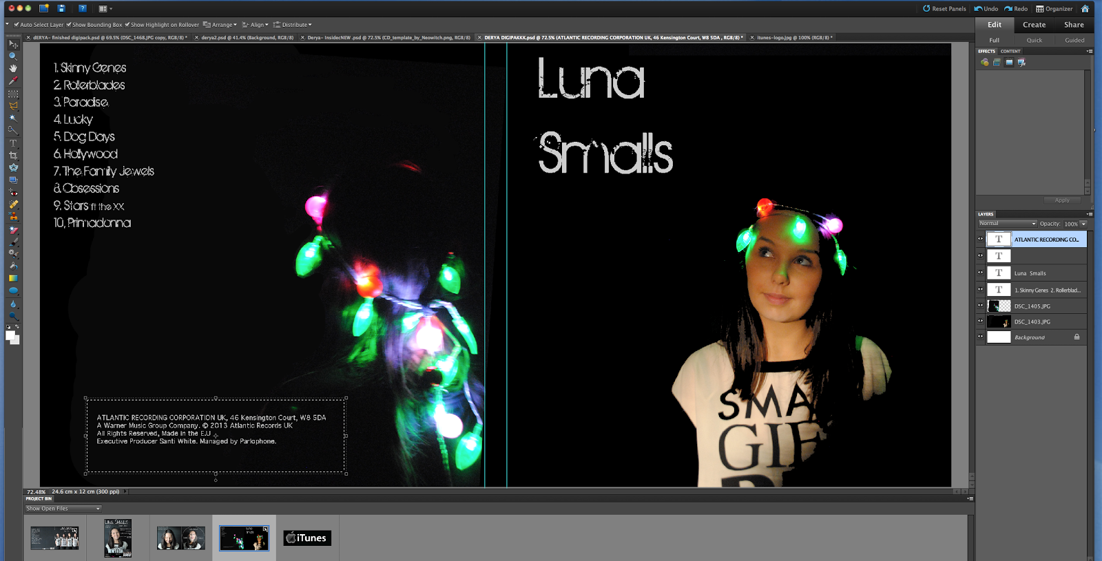
This was just a mock idea of another digipack, with the recent pictures we took, with our artist Luna Smalls, wrapped with fairy lights on her head.
Tuesday, 11 December 2012
PLANNING: Practice digipack idea

This was the unfinished piece of the mock digipack idea. By using Photoshop Elements, I was able to change the colour by moving around the Tint, Shadow and Exposure. With this I was able to see which colours I wanted, and so I decided to go along with red, purple and yellow. I think the colours did go well, but I got feedback from one of my teachers, Dan, and he commented on the red, that it did not go well as the others.
This was only a practice version, I was just trying out the different aspects of Photoshop, bringing in the images and trying to match it with the background. At first I had thought of just keeping it one colour background, which was hard because I had to find the right colour to match it with, since some bits in the background did not have any colour. Afterwards since I changed it and added effects, it actually didn't matter about matching the colours at the begginning.
I did not have enough time to add the name of the artist or the title of the album, but I will be doing a story board showing where they will go. Also, the tracklist will be on the image in the middle (the 2nd image on the template).
I think this practice really helped me out with using Photoshop, since before I had not used it much. I am now more familiar with the tools and I will be able to contribute more when we do our final digipacks.
Ancillary Planning: Mock Up Pictures
Here are the pictures that we took for the mock up digi pack that we took this lesson. We are now going to edit and put them on the digi pack so we have an idea of the outcome.


Monday, 10 December 2012
PLANNING: Font examples

The fonts I have used here are:
Book Antiqua
Monaco
Hand of Sean
Birth of a Hero
Trajan Pro
Thursday, 6 December 2012
Research: Analysis of magazine advertisements


They have also included her website which is useful.

By looking at these advertisements, I have a better understanding of how to go along doing my own advert for my artist. Examples may include to add things such as: website, company logo, where to purchase (like iTunes).
Subscribe to:
Posts (Atom)