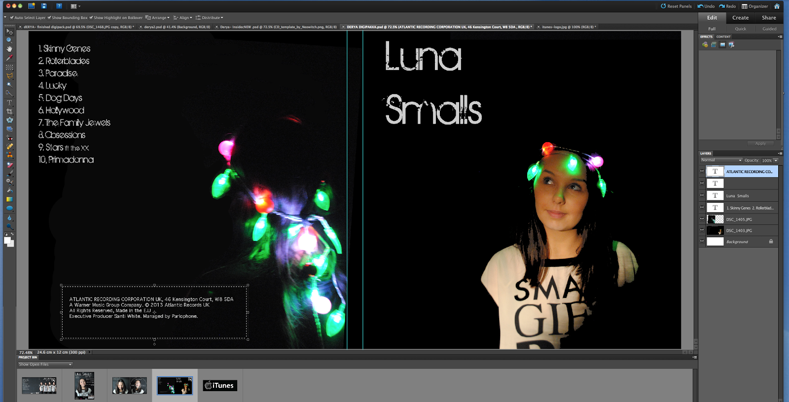
Here is my completed digipack the outside and inside. I went for a more simple looking digipack as we had quite a few pictures that we liked so i didn't want to make it too busy that people would see clearly who the artist was straight away. I also think with the way I made the digipack look would make it appeal to different audiences and would give the artist room to go in different directions of music.
Friday, 11 January 2013
Thursday, 10 January 2013
Planning: digipack ideas (front)
Whilst going through a few digipacks, one that caught my eye was the E Street Band's one, also known as Bruce Springsteen & The Street Band. With their digipack, it has a continuous colour theme, which is black, yellow and white. These colours go well for the genre of music they are playing, which is rock. I also liked the font that they had used, its bold, has a scratched effect on it (in black, whilst the actual font is in white). The digipack is plain, but effective.
I was inspired by the front image of the digipack, where the whole band is up against a wall, on a street which reflects to the title of their band. So I'm going to plan on taking pictures of our artist, Luna Smalls, in mid shots or full body shots, and see if I can replicate her body in one image. Basically having her to do different actions in each picture I take, and putting them together to create a multiplied effect of her. Since our artist is a solo artist, it will only be her, and no one else in the picture, unlike in Bruce Springsteen & The Street Band's one, where they used all their members.
I'm hoping that it turns out the way I want it to be! By using Photoshop, this should not be a problem to do, but it just may take some time going around each image and cutting (around) the body from it.
I was inspired by the front image of the digipack, where the whole band is up against a wall, on a street which reflects to the title of their band. So I'm going to plan on taking pictures of our artist, Luna Smalls, in mid shots or full body shots, and see if I can replicate her body in one image. Basically having her to do different actions in each picture I take, and putting them together to create a multiplied effect of her. Since our artist is a solo artist, it will only be her, and no one else in the picture, unlike in Bruce Springsteen & The Street Band's one, where they used all their members.I'm hoping that it turns out the way I want it to be! By using Photoshop, this should not be a problem to do, but it just may take some time going around each image and cutting (around) the body from it.
Planing:Didgi Pack
In the beginning my plan was to create a 3 panel Didgi pack but during the process i decided a 2 panel would be better as the simplicity of the design would suit it better. i found that designing the inside didn't look as well as i'd hoped but looked to cluttered.
Wednesday, 9 January 2013
PLANNING: Digipack (changing idea)
A couple weeks ago, I decided to change my digipack idea, since I was not getting good feedback from it, and it did not look great. I am going to go with the front cover being multiple pictures of our artist, Luna Smalls. I'm hoping that cutting the images apart and putting them together will create a sort of edgy feel to it, so that it doesn't look so perfect. I hope it turns out like the way I want it to.
Monday, 7 January 2013
Ancillary - Production: Review of mock digipack.
Our digipack is self – titled, we thought this would be
appropriate as its Luna’s first studio album. I think my album art is very
interesting and attractive for the audience because it its quite animated the
background is displaying the milky way, I got the idea from the name Luna
because it relates to the Moon. I thought that adding space and stars would
help Luna’s audience identify the album. Of all the photographs we took for the mock
digipacks, I chose this one as it isn't to ostentatious and wouldn't draw
attention away from the background. Artists such as Rihanna and Beyoncé
inspired the picture on the front; on their albums their front pictures are
very demure and pretty. I decided not to add a picture of the artist on the
back because I felt that it didn't need to be there. I was inspired by Plan B’s
Ill Manors album and Santigold’s Master of my own make-believe album. The
simplicity of their back covers contrasted with the front cover of their album
which emphasised the front more.
The inside continues the space theme, as I believe that
continuity will make the digipack more conventional. I decided not to include a photograph on the
disc because; it would make the image look distorted. The font on the disc is
the same as the font on the front of the album; this is conventional on most
digipacks. I decided to make the disc and the inside of the digipack the same
because I think that added a new image for the disc would disrupt the flow of
the inside cover.
Wednesday, 2 January 2013
PLANNING: A quick mock idea of a digipack
This was just a mock idea of another digipack, with the recent pictures we took, with our artist Luna Smalls, wrapped with fairy lights on her head.
Subscribe to:
Posts (Atom)