Tuesday, 15 January 2013

Anchillary Completed

Here is my completed anchillary, including my digipack and advert. I have made them a little different as the image I chose for my advert isn't the same on the front of my digipack as I really liked the picture that I had lights in my hair and I personally thought that it was very eye catching and would appeal to our target audience. The advert and digipack have the same colour scheme as the colours were a beige/nude colour and black. The top in the advert is the same as the inside of the digipack as I wanted all of the anchillary to fit together and flow so that the audience know straight away that it is Luna Smalls. Overall I am really pleased with what I have achieved as I didn't want my anchillary work to be over complicated.

Ancillary- Production: Final booklet for first digipack.

Looking at other artist's booklets i decided to copy the front of my digipack, so i can display it on the front of my booklet to add continuity.

I really like this digipack because i got to use pictures that didnt work with my actual digipack, i decided to continue the space theme as its colouful, fun and bright which will attract audiences.

Ancillary -Production: Screen shots of Editing.

I have done alot of editing today, i started with erasing any mishaps and changing any mistakes that i may or may not have wrote. I also decided to change the background on the inside of the digipack because i felt that it looked out of place with the pictures also displayed on the inside cover.
This is the inside of the booklet that i created for my second digipack, its much more toned down than my other digipack and more mature. For my digipack i took inspiration from artist Pink as i analysed her digipack in class. Her digipack consisted of photographs of the artist and lyrics of her songs.

This is another page of the booklet i created i decided to only have an inside and an outside, so i will have to choose between this page and the previous one. I decided to make it black and white because i thought that this would add an elegant touch.

This is my new background for the inside of the digipack, i have still stuck with my space theme but i decided to have a nebula as a background instead of stars because nebula's have bursts of colour and are spontaneous.


As i decided to contrast the cover and inside of the Didgi pack making the outside white and the inside black with the same design ideas i believe this makes both the inside and outside attractive but also that stand out factor. I wanted to create a simplistic but sophisticated turn on the design ideas, i didn't to have too much going on with the front cover so that the audience could see w the artist in a standard way and for the plain white pack to attract them amongst other Didgi packs in stores. Both Fonts i used for the artists name and the tittle of the album perfectly suit and complete the style, Her name is bold and attractive and clear to read whilst to differ her name from the rest of the text i made the 'Skinny Genes' in a signature styled writing, again to suit the sophisticated design.


I also continued to use the same signature font with the song names on the back and also on the CD itself. i wanted the inside to be alike with the ouside so that there would be a clear contrast. although the images are alike they are different but i wanted to differ them more using photoshop where edited the image a little darker not as faded as the outside image,


Sunday, 13 January 2013

Ancillary- Production: Digipack back up.

Recently my teacher told me that i might not be able to submit my previous digipack as i used images i found on Google for the background.
If this does happen and i am unable to submit my digipack i made a different one so that i wont be hindered.


I decided to go for a monochromatic effect, because i thought that it would display that the album has alot of depth to it.
This is completely different to my first digipack which was quite animated. I think that this digipack would target our older audience.

Ancillary - Change of Digipack.

While reviewing my digipack my teacher told me that the font on the back cover looked really amateur compared to the font on the front, he also informed me that the inside photograph looked out of place.

I decided to change the both the photograph on the inside and the font.

As you can see the font on the back of the front of the digipack has improved i also decided to change the font of the artists name as i think it looks better this way.


As stated before i decided to change the pictures on the inside, i think this three photos make the album more playful.


I also decided to create a booklet, i was inspired by Marina and the Diamonds album for The Family Jewels, i think this booklet will appeal to Luna's audience more.

Ancillary: Making Album Poster.


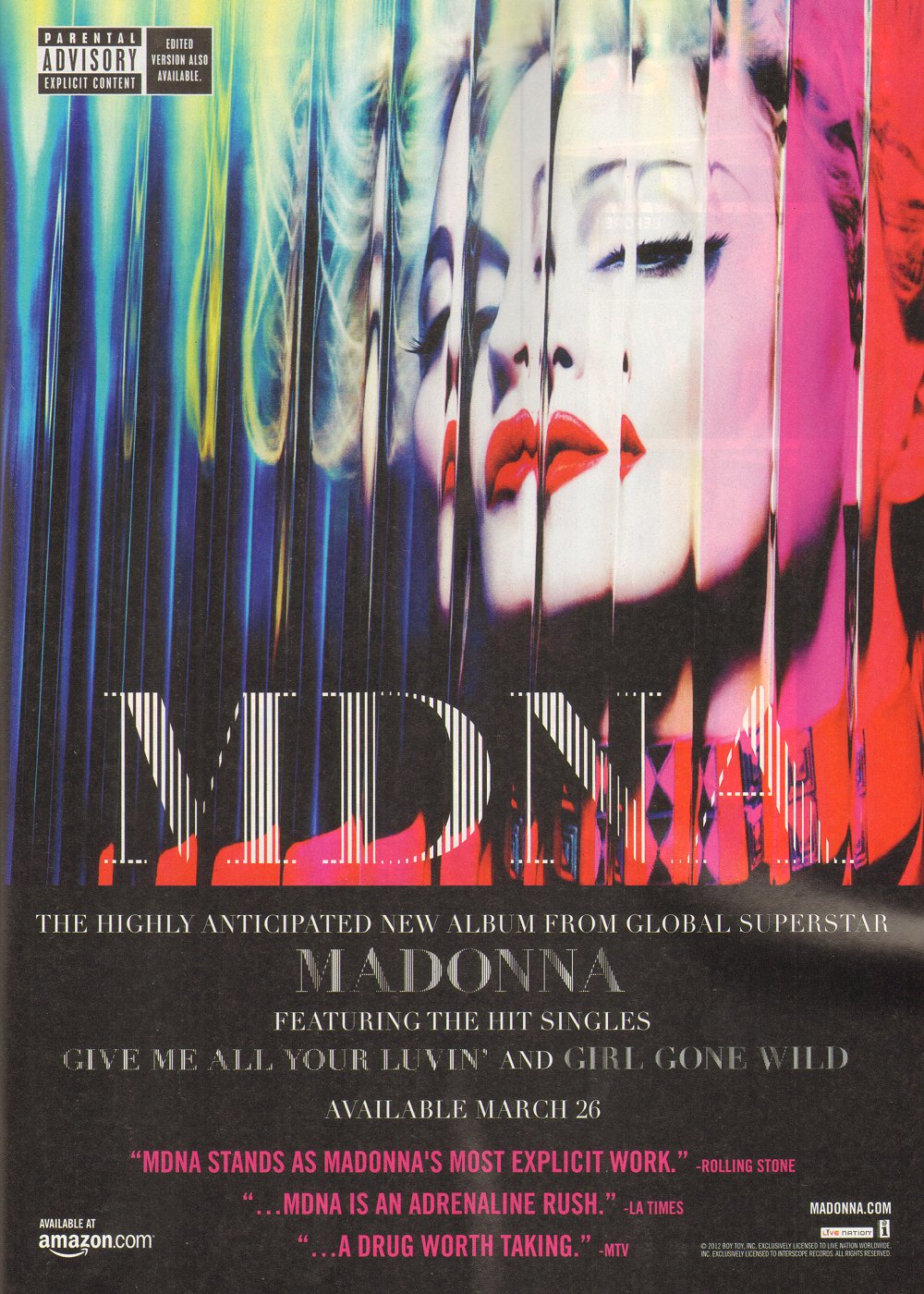
Here is a screen grab for the album poster i am making i took inspiration from Madonna's advert for her recent album MDNA.