Monday 17 December 2012

Ancilary- Planning: Album Covers.


These four album covers, have really inspired my digipack design, i really like the close ups of Adele's and Rihanna's albums as i think they are more intimate and share a more personal aspect of them with their audience. Whereas with Beyonce's album cover for I AM..SASHA FIERCE, its more powerful and authoritative which compliments the overall tone of the album.  Rihanna's hair on her album cover is very bright and goes with her bright red lipstick which instantly attracts the audience. I also like the how Rihanna is posing in her album cover as its pretty and much calmer than her usual over-sexualised look. 
I particularly admire Adele's covers for her albums 19 and 21, as they are very simplistic but also say quite alot. I like that the photo for 19 is just her fringe, her left eye and her nose as i think its very artistic compliments her music as its very emotional and raw. I think as our song is very upbeat and quirky we might be able to interpret Adele's pose for her album 21 into our album to and instead of our artist looking down she could look at the camera with a smile.

Thursday 13 December 2012

Ancillary Planning: Mock Up DigiPack (FRONT)


Montage créé avec bloggif

Here is my mock up of my first go at making a digipack. I used photoshop elements but found it a little bit difficult as I am used to the normal one and this is more basic so some things I wasn't able to use. Also  I was able to use the paint brush to help choose the certain colour from the background, I found this was a very useful experience to be able to understand how it has to look. With the actual picture I didn't change the colour but I did edit the picture by changing the low lights, shadows and naturals so give more of a contrast to my face. When we took the pictures the picture I wanted on the front I liked the neutral colour across the whole digipack. All together I was really pleased with how it looked. I did start out with a 3 panel but it was proving difficult so I changed it to a 2 panel and printed it out to make my own font for the artist name. I used bubble writing but made it look sharp which I think fits well with the genre and the music and especially our target audience. I also chose for my individual mock up to have each letter of LUNA in a different bright colour. I really like the way I added the track listing the side of the picture and it fit just right. For my first go at a mock up I was really impressed and now I'm going to work on the inside wish me luck..

Tuesday 11 December 2012

Ancillary - Production: Font for Artist Name.

0tgaCI on Make A Gif, Animated Gifs

These are 12 different fonts that may be used in our final digipack/ advertisement. They vary from animated and fun syles to, quite serious and mature. As we have a wide range of audiences, all of these fonts can be used.

Ancillary - Research: Mock Digipack.


I really like the mock digipack i created, as her name is Luna, i really ran with the idea of space and stars because i think this will make our digipack stand out and be recognized easily. Also i think the idea of space is very appealing as its loud and different to other albums.
I decided to make a 3 panel digipack so that i can have an extra flap for the inside, i decided to add photos, as to show that, it was an extra something for Luna' fans. As you can see, i hadn't finished editing the pictures properly, i filtered the pictures i took of Lyah by adding Film Grain, and changing the saturation but have decided to change this because the display on the outside of the Digipack is far too different.
I really like the font i used for Luna because its big and animated, which i think relates to the overall tone of our artist. I fond the font on Photoshop and was very surprised by the range of fonts they had as initially i thought i was to use Quark Xpress for my text.
Overall, i really like this mock digipack but i think for the final it should be toned down.

PLANNING: Practice digipack idea


This was the unfinished piece of the mock digipack idea. By using Photoshop Elements, I was able to change the colour by moving around the Tint, Shadow and Exposure. With this I was able to see which colours I wanted, and so I decided to go along with red, purple and yellow. I think the colours did go well, but I got feedback from one of my teachers, Dan, and he commented on the red, that it did not go well as the others.

This was only a practice version, I was just trying out the different aspects of Photoshop, bringing in the images and trying to match it with the background. At first I had thought of just keeping it one colour background, which was hard because I had to find the right colour to match it with, since some bits in the background did not have any colour. Afterwards since I changed it and added effects, it actually didn't matter about matching the colours at the begginning.

I did not have enough time to add the name of the artist or the title of the album, but I will be doing a story board showing where they will go. Also, the tracklist will be on the image in the middle (the 2nd image on the template).

I think this practice really helped me out with using Photoshop, since before I had not used it much. I am now more familiar with the tools and I will be able to contribute more when we do our final digipacks.

Ancillary Planning: Mock Up Pictures

Here are the pictures that we took for the mock up digi pack that we took this lesson. We are now going to edit and put them on the digi pack so we have an idea of the outcome. 


Monday 10 December 2012

Ancillary- Research: Analysis of 3 Advertisements.

Analysis of 3 advertisements.

Ancillary Research: Analysis Of Digipacks


 This is Taylor Swift Red her new album which is also a digipack. She has kept hers very simple which is really effective. She has used two fonts, and a maximum of 3 colours *red, white & black*. They have also made the album name in the same colour as her lipstick which is a convention with albums. They often have colours from the artist and then they use it on colour picker, this helps to blend it together better. It also is a close up shot of her face as it connects with the audience. She also has a promotional sticker on the side as it shows 16 brand new songs, which will entice her audience to buy it as there are new songs. I really like the simplistic look this gives and it also stands by her as an artist.


This is Florence and The Machine Ceremonials album. This is a lot different to Taylor Swifts as there is a lot more going on. First of all this is a lot darker, she also has two fonts. The most eye-catching thing to this cover is the image of Florence. Its a mirrored image showing her back and the side of her face, it's very different and unusual which Florence often goes for. The word Ceremonials looks very eye catching as well as it isn't in a normal font. Overall this again stands by what the artist is like so that the people that enjoy her music just know its her by the look.

PLANNING: Font examples


The fonts I have used here are:
Book Antiqua
Monaco
Hand of Sean
Birth of a Hero
Trajan Pro

Thursday 6 December 2012

Research: Analysis of magazine advertisements

The first advertisement I will be looking at is Marina and the Diamonds' Family Jewels. She fits perfectly to the genre my artist is. As we can see, they have basically used the front of the digipack cover. The font is done as if its written by someone on paper, with the same retro/vintage looking background with the plants/floral print. The name of the artist is in bigger fonts, which attracts her audience, or anybody else that sees the album on a shelf. It needs to be recognizable. It also has a second smaller image, which is to get out her new single 'Shampain'. This is a very effective way of getting more people to buy it, since they may know of that single already. The smaller image of the CD is done by using the same font, but just in pink, so maybe its easier to distinguish it between the album and the single. They have also added an "Out now on iTunes" phrase. This is usefull for the audience, as iTunes is where most music is bought. I really like this, as it is just the artists face on the advert, its appealing.


Here is Jessie J's album advert "Who You Are". Her face is clear, it attracts the audience straight away, we are drawn to her face and her name instantly. The colours used go well with each other, the font is big, golden, and bold. Right underneath it there is the album title, in italics, smaller, white font. They have promoted Jessie J's previous smash hit "Price Tag" which features another famous artist named B.O.B. This is a great way of publicity since B.O.B. fans may also enjoy this music. Her genre is mainly R&B-Pop. Even though it doesn't match my genre perfectly, it still shows a strong female artist. We both still have the same target audience, which are people around the age of 13-25.
They have also included her website which is useful.


Finally, Two Door Cinema Club's 'Tourist History' album advert. They are mainly indie-pop/rock. Which is pretty similar to my genre, and their target audience may have more of a range of people, since they also have rock. However, I thought their advert was very effective. Their band name is written in a funky font that's the largest of them all. And then straight underneath it, is their album title. They have written that it is 'out now' and extras that their audience may be interested in. The colour scheme is plain and simple, its a monochrome effect. Also, the main picture in this is a cat, with a crown and sparkly eyes. This looks a little strange but in a good way. They have also added tour dates underneath which is effective, as their fans can see when they are coming to their city to play a gig. And again, they also have added their website, for people to get more information from.


By looking at these advertisements, I have a better understanding of how to go along doing my own advert for my artist. Examples may include to add things such as: website, company logo, where to purchase (like iTunes).

Research: examples of advertisements in magazines

Here's a gif just capturing some magazine adverts of albums I have seen.

Mounting created Bloggif

These bands however did not relate to my genre, but I took pictures of them for inspiration.

Ancillary - Research: Analysis of 3 Digipacks.

Mounting created Bloggif

Lady Gaga's album for The Fame Monster is very consistent the colours are quite plain consisting of dark grey, black and white, which i think supports the overall tone of the album. The album cover is a mid-shot photograph of lady gaga with her coat collar covering her mouth. The album contains the same font on the track listing and CD. As this is Deluxe EP, the album  contains to discs. 


Mounting created Bloggif

Santogold's debut album cover is very quirky and surreal, the cover shows santogold with her mouth open leaking gold glitter, i think this is very fun and epitomizes her alternative pop/ dubstep sound. I particularly like the CD and it's my favorite CD design compared to the other digipacks i analysed  i like that at first glance all the images look identical but are in fact different and quite eerie. The back cover of the Album has a gold glitter back ground with the track listing and the bar cod on the bottom left corner. The font is unconventional and childish which i think relates to Santogolds music.

Mounting created Bloggif
I think that Marina and the Diamonds' Family Jewels album is reminiscent of a painting as the colours are quite muted and airbrushed. This album contains a booklet with song lyrics and acknowledgements which makes the Album more personal for the audience. I really like the photographs as i think they are very demure and pretty compared to Santigold and Lady Gaga's photograph. When taking photographs for our Digipack i think i will be more inclined to ask our artist to pose like Marina as the shots came out very good. Despite this, i didn't like the CD design, because the songs on this album were very animated and immature i would have suspected there to be more colour to attract a wider audience. My favorite part of this album is the font, as it is very attractive and big, the track listing at the back of the album is'nt conventional and makes the album more attractive.

Wednesday 5 December 2012

Research: Analysis of digipacks


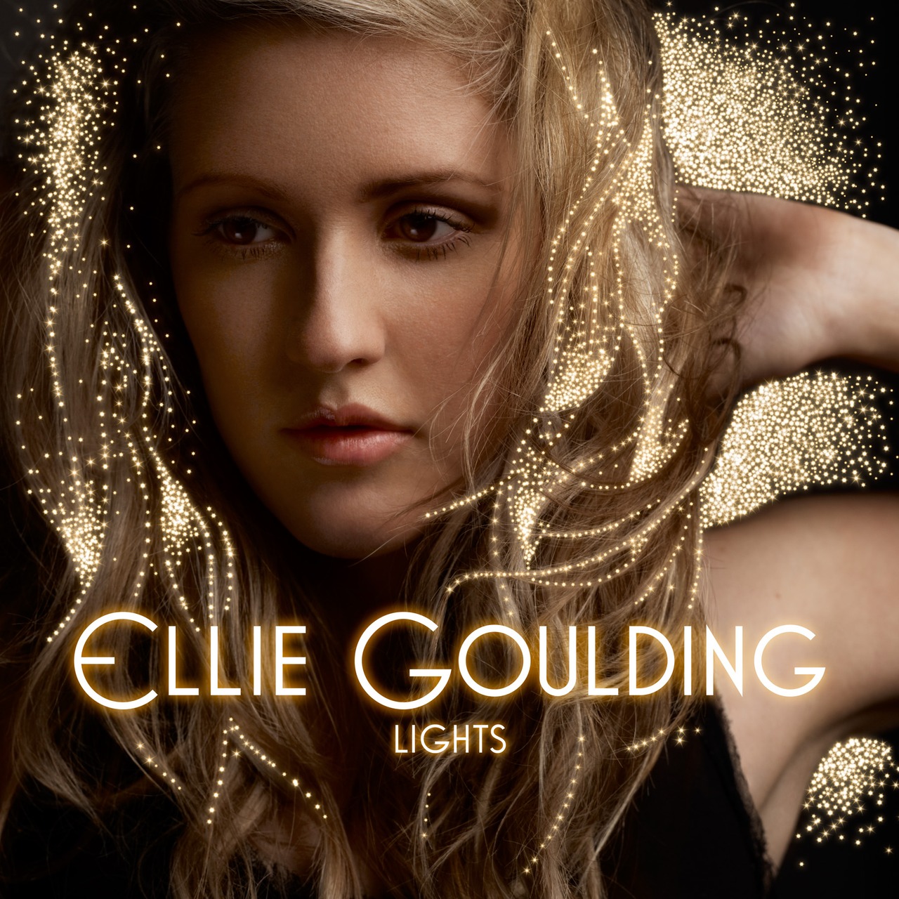
My first example of a digipack is Ellie Goulding's Lights album. The front of the digipack is displayed with Goulding's face, big that covers the whole space. It makes her face youthfull with the no make up look(more natural make up) which is great for her target audience, ( There is a strong sense of continuity in terms of colour, as we can see its mainly black and gold. On the image that she has used, there is a sort of shimmer/fairy dust which can be related to fantasy, something unreal. In terms of it going with her genre (which is indie folk + electro pop) we can see the edginess.
With the font, it is as if her name, Ellie Goulding is lighting up, since it is bright and seems like it is glowing in the dark (due to the lights). This is a very clever way of making the album name a concept in her digipack.

The back of her digipack is plain, but it still goes along with the colour scheme, by having the font in a sort of gold colour, simple but effective, since the front is already filled up with an image of the artists face.

Ellie Goulding's digipack does also relate to my genre (which is indie-pop) because she herself is in that genre. Same with her target audience, we both aim to the younger teens+adults around the age range of 13-25. The album cover looks youthful, which I am planning on to do with my digipack too.


The next digipack I will be looking at is "Family Jewel" by Marina and the Diamonds. Her genre is similar to my genre again, hers is Alternative/indie-pop too. For the front of her digipack, they have used the face of the artist, looking straight at the audience (whilst laying down). Her stage name, and title of the album is placed on the left, and it is one of the things that catches our eyes and makes us want to read it. It's font seems funky just like the vintage looking background. This may be used to attract Marina's target audience, just like ours, who are people (mainly females) aged 13-25.


The back of the digipack is done in a very creative way. They have put the track list going around  Marina's face. It stands out, edgy and quirky.  Even though I think a bit more colour would go well with this, it still does attract their target audience well. The track list is in the same font as the title  + album name which is good.

I really like the photo's they have taken for this digipack, and I too am planning to take close ups of my artist, and play around with the effects on photoshop to try out how it'll look.


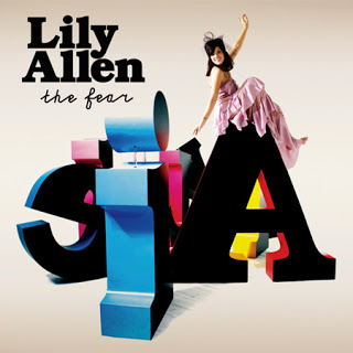
Finally, the last digipack I will be looking at is Lily Allen's 'The Fear' album. This again is similar to my genre, Allen concentrates on pop music, same with us. In the front of the digipack, we can clearly see the bold black font that writes her name, and her album title in italics and smaller. The cover looks interesting, Allen is placed sitting on top of letters, the main on being an A (representing her name). She's in a baby pink dress, and seems to be wearing a hair accessory (looks like a tiara). It seems a little childish, but it targets her audience well, which again is people ages 13-25. It's full of colour, yet not messy.


The back again replicates the letters/design from the front cover. Its consistent and conventional. It has the track list placed above the design. And we can see the record label logo + other company logo's well. Its simple but effective. I really like this digipack, as it stands out, and different from what Lily Allen usually does.

I was inspired by these 3 artists for my own digipack. None of them have used really bold colours (wit the exception of a few in Lily Allen's one) which I plan to take on. I think having only a few colours present is more effective than having so many going on and making it look messy.

Research: Examples of Digipacks

These are just some digipacks I have found, and thought I could come back to it, and get more inspiration from.

Olly Murs:                                                      Pink:
Mounting created Bloggif      Mounting created Bloggif


    The Nuggets
Mounting created Bloggif


As you can see, some are 3 panel digipacks and some are 2 panel.

Ancillary Research: Class Discussion

We had a class discussion in our first lesson after the music video was finished, and began to discuss our ancillary project. We discussed the importance or digi packs and here are some of the things our class came up with. 

Friday 30 November 2012

Production: Summary of Editing Experience.


Production: Last day of Editing.

The last day of editing was very stressful although the end result was great. My group member Derya and I decided to add text to our video to make it more interactive for the audience so that they can sing along with the lyrics. I added them in bright colours such as canary yellow, turquoise and neon green so that its abrupt and attracts the audience. I also added more special effects such as desaturate and slow mo with boring scenes to make them more interesting. I also edited fillers by speeding them up or making really fast cuts so that the viewer will always be entertained. I used one shot of our lead in the box park in Brick Lane swinging from a bench and cropped the sides so that I can duplicate the scene so that the screen will be spilt into three and she would be swinging her legs in time to the beat particularly in place where Eliza Doolittle whistles in the chorus.
To conclude the last day was unbelievably stressful and as a group we encountered some problems along the way but it was all worth because I am very pleased with the end product.

PRODUCTION: Last day of editing

The last day of editing was very stressful because at first we thought most of the editing was done, but realised there were a few blank bits that we had to fill. Me and one of my group member, Emma, added texts to our video. We added the lyrics to the chorus, where we believe were the catchy parts of the song. I believe that this was an interesting feature to add to our video because the audience can sing along with the song.
We encountered a lot of things in the last day of editing, such as some clips being deleted, or being unsaved, some moving around so we had to adjust it again, and the lip-syncing going wrong. I added special effects such as desaturate and slow motion to scenes where we thought we couldn't add it, but once we tried out the effects the clips worked well.
One edit that I really liked was when I had used our aritsts leg swinging motion along with the whistle of the chorus. I duplicated the clip 3 times, so the legs moving from one side to the other matched each other. It was hard to actually get them to swing at the same time, but with a bit of time, we were able to do it. I thought this worked really well, and made it more fun.

Overall, editing had gone good, just that the last day was very stressful, since we were scared we weren't going to be able to finish it off. Fortunately, we did finish it off, and I really like our final video. It looks fun and exciting which I actually doubted (at the begginning), but we made it work with the edits and the texts.

PRODUCTION: Skills Development 2

Prior to A2 Media, I had only known the simple aspects of editing, such as cutting, adding in simple effects, and sound. Now, I am able to cut videos by using the eraser tool, add markers, use motion, reverse and use special effects, dual screen/sections etc. These were very useful when coming to edit my music video. The markers were something that we had to work on, trying to mark where the verses/chorus began and where there is a beat that stands out in the video, that we could edit along with. I think they helped us a lot because it made it easier for us to align the videos to the correct places, and so that the syncing was right too.

In AS we did not have to think about shooting the same shot so many times for our thriller, but since we were shooting a music video this time, it was more hard, we had to film a lot of base tracks of our artist. This meant that we had to film our artist singing along with the lyrics from different angles, since each of them count as a base track and we were told to take as many base tracks as possible. 
One thing that we did do, and that we didn't in AS, was dismemberment. This is when the camera only shows a part of the human body. We did this in order to appeal to our male audience, so we had our artist's body parts filmed, such as the chest area. Another thing we did add is colour correction. In one of our scenes that was in Banksy Tunnel, the lighting was very dark. In order to brighten up the scene, we went onto 'modify' then to 'video filters' and finally to 'colour correction'. This skill was very useful because we thought we would have to re-shoot the scenes again but we did not and just used the effects to adjust it to our liking. 

I also learnt how to have dual screens, which we did use in our music video. In order to do this, we went onto motion and changed the frame of each footage we had. This made a good effect to the beginning of our video, and it looked different too. 

Overall, I believe that the production of our music video went well. We were able to shoot at the various locations, using different effects to make the scenes more fun and also trying to get the lip-syncing right. They have all helped me to make a better music video, that appeals to our target audience.


PRODUCTION: Skills Development 1

For our production in AS, we did not really think that much about locations, since the thriller opening I had done was set at my house, in my bedroom. However, for our A2 music video we had to think carefully about our locations. We had at least 4-5 locations to go and film at. This year, we used more props such as the masks, the costume change was crucial too. We made our artist wear different dresses, but due to the weather it didn't turn out as we wanted it to. We also tried to remember to shoot base tracks, more than we did in AS. We took more shots of her moving around, her singing from different angles, so it looked more effective.
Overall, I think more effort was put into this music video because we had to think about more stuff such as the costumes/props/locations/mise en scene in general. All of these effected the kind of song we were  doing, which was a pop song thats very upbeat and cheery.

Thursday 29 November 2012

Production: Skills development

juksdE on Make A Gif, Animated Gifs


Production: Review of third day editing

The third day that we edited was very fun, I had become more confident now that I have edited twice so I began to use special effects and split screens, this was to make the most of our boring shots. As we didn’t have enough close ups I use a mid-shot scene and went to ‘Motion’ then scale so I can create a close up to give our music video variety.  We used the special effect ‘Light Rays’ so that our dull footage of Luna Smalls singing in Lee Valley would be colourful and bright. We also slowed down the footage of a group of volunteered dancers in Banksy tunnel so that it would go along with the tempo of the song.  We added this footage at the bridge because it is much mellower and slow than the rest of the song. We also began to add fillers for example Luna Smalls sitting in different places of the same bench we put this when Eliza Doolittle whistles in the chorus as it’s quirky and fun, we also cut footage that we took in Regents Canal as we were inspired to do so by a previous students work where they placed there lead in different places of the same shot and moved them along to the beat.
Overall the third day of editing was very worthwhile as we began to develop our music video more with special effects.

Production: Skills Development part 1

A2 differed from AS planning and production because there was more to do, with our as coursework we filmed in one location for two days which was simple as there wasn't any risks and during cold weather it was a much better environment to work in. We also didn't have any costume/make-up changes which saved us on time. Although as our thriller was set in the evening we had to wait until nightfall to film our scenes this hindered us because some of my group members lived far from locations.
For A2 we planned exactly where and what time we would be filming our video, this was so that we  could avoid huge amounts of people and traffic.We also had alot of colourful costume and make-up changes which made pro-longed filming.
Approaching the editing for the music video was quite nerve-racking, I had quite amateurish skills, for example brightening and darkening footage, adding text and overlaying images. 
To conclude, i think that A2 editing was much more complicated and more time was spend on this music video because it was harder to edit than a thriller.

Production: Last Day Editing


Skills Development: Editing

This A2 year I have done a lot more editing and am very proud of myself for that as in AS I wasn't really editing that much as much as some of the others, but this year I made sure I would definitely help with the editing especially as we have to write about it in the exam. The editing process went quite well to me as we used effects which allowed us to brighten any clips that were too dark and also to just make it look a bit different like we used light rays but kept my face clear and in focus. We also used the clips that had me in one location but moving in different parts and we put them together and it looked like I was moving like that by myself which looked really cool. We also added text to blend it together more and changed the colour sometimes to add something that will make the audience keep watching. We also changed the speed of some clips either sped up or slowed down and we also used the reverse tool which made the scene go backwards which we got great feedback from. This year I am really proud of our music video as I think it looks really good.

Monday 26 November 2012

Production: Rough Cut Feedback

Overall I wasn't too happy with the rough cut as we hadn't finished it properly and at the end it was just one base track playing. I am very pleased with how the beginning edits turned out showing the dismemberment as  this was something our group wanted to do from the beginning. I really am proud of our group for actually achieving this as I was not sure we would be able to do it as it looks very technical but from the great help from the media technicians and teachers we were finally able to achieve it. As we were running out of time we were not able to begin adding effects to the footage, especially for our Banksy Tunnel as it was darker than we expected as the entrance was already being used. We were very unlucky with our filming days as every time we went out it was either 5 degrees or was pouring down with rain and as I was the artist had to change the outfits to suit the weather and my health is more important than wearing summery clothes. Overall I think there is a lot to improve on but with Tuesday's lesson which is 3 hours and going work shop I am sure  it will turn out great. I have a lot of faith in us that we will accomplish a great music video.

Production: Class Feedback To Rough Cut

Here is the video feedback that our class gave us back after watching our rough cut. We are going to take the comments on board as it is constructive criticism. So here it is...

PRODUCTION: Rough cut feedback

I think our group did not really have that much time to finish up our roughcut, so it was not that great when we showed it to the class. Our class liked the beginning when we split the screen up to 4, (dual screens) and had different clips of dismemberment playing. They also liked the part with the hand, where we count down from 5 to 1, and once it hits 1, the lyrics start. I thought we did really good with that shot, it was a little edgy which fitted well with the video. However, the class did point out that some clips didn't match, such as the part where our main artist was rubbing her arms (we had forgotten to take it out) and it showed on screen.
Overall the feedback from the class

Thursday 22 November 2012

Production: Review of second day editing

As we needed to get our rough cut onto Blogger editing was quite fast which is why our rough cut was quite plain and boring. We had a time limit and we also needed to feedback on other people's rough cuts which meant that we weren't really paying attention to editing ours.

In hindsight, i think that we should have asked for more help, so that our rough cut would have been much better to watch. We were only able to edit, some footage and then left one long scene beginning after the chorus and finishing when the song ended. I think this experience has taught me that we have to organize and plan our time wisely.

Rough Cut Video


Wednesday 21 November 2012

Production: 2nd Day Of Editing

These are my pro's and con's of the second day editing. Overall it went great and I am so pleases with how it is looking already, and I am really happy with how the lip syncing looked as a few people viewed it and didn't realise I was actually singing. I have to say I'm very proud.


Production: Video Footage Of 2nd Day Editing

Here is video footage of our second day of editing.


Tuesday 20 November 2012

Production: Editing Day 2

Here is a slideshow just showing our group editing and showing a little bit of the footage.

Production: Review of first day editing.

The first day of editing our music video had a lot of hiccups, as a group we wanted to entertain and attract the audience right from the beginning so we decided to split the screen into four sections as we wanted to dismember our female lead, to target our male audience.


Pros:
☮We learnt how to create a group screens. 
☮There were alot of teachers around to help us with editing.
We were able to sort out all of our footage by placing them in different folders created on Photoshop.
☮We planned out the rest of the music video.

Cons:
☮ Not all of us got around to editing. 
☮There was a time limit.
☮Importing all the footage took a long time.

Production: Luna Smalls Endorsement

Luna Smalls has an endorsement deal with Vera Wang to help promote her perfume 'Princess'. This endorsement will attract a wider audience and also gives Luna exposure as an up and coming artist. Vera Wang is a good stepping stone because its a very sought after and popular fashion label.


Photographed and Edited By Emma Nwachuku

Production: Digipack Ideas 2

Here are some more digipack ideas...


Production: Practice Digipack Shots


This is a slide show of pictures we took of our artist as practice shots for our digipack. 

Sunday 18 November 2012

Production: Luna Smalls Fan Page.

Our group decided to make a tumblr fan page for our artist Luna Smalls, we thought that this would be a great way for fans to share there interest of Luna Smalls with other fans, as Eliza Doolittle also has a tumblr fan page we thought that this would make Luna Smalls seem more realistic.


Fan Page.

Production: Review of Production so far.


Production: Review of Last Day Filming.


Our fourth and final day of filming was good we decided to film the fillers for our video because we have filmed the whole song in numerous locations. Our group member Derya brought a bag of props containing sunglasses, rings, bracelets and collars, so that our video will be more fun and entertaining for the audience and to target a wider audience preferably fashion lovers.
The box park was a really great location as it displayed avant-garde, colourful and attractive photographs that worked well in our scenes. The box park had wooden tables and benches and a small tree which that had a wooden bench enclosed around it which added a magical effect to our scenes. There was also fairy lights that were wrapped around the railings of the box park which made the overall tone very pretty.
To conclude I think that filming went well, we were able to get a lot of shots although the weather hindered our filming time. The Boxpark was especially nice that day visually, which was advantageous for us because we didn’t have to bring a lot of props to make the scenery exciting.

Saturday 17 November 2012

Production: 1st Day Of Editing

Thursday we began our editing and we had a slow start as we needed to make files luckily I personally had put the markers on the song so that it was one less thing to worry about. We noticed we had a lot of footage which was definitely a plus even though that took some time to make the files. This was very helpful and efficient as we now knew where all the footage for each location was and this will help us save time the next time edit. Our song 'Skinny Genes' by Eliza Doolittle has quite a long introduction so we had fillers and was going to have a funky, fast edit to keep the audience interested. So we decided to do a shot of my phone showing the song which leads into the music beginning. We also began to learn how to have more than one shot on the screen at once which was very useful so overall I personally think we did very well as a group overall because we all chipped in as we know what our strength's and weakness' are so we work really well together.

Friday 16 November 2012

Production: 1st Day Editing

We first began editing, starting to make our rough cut and here are some stills of us working on final cut pro, and you can see everyone pitching in not just one person. It was very time consuming at the beginning but we managed to get through through working together as a team not leaving it to one person.

k4mfrE on Make A Gif, Animated Gifs
make animated gifs like this at MakeAGif

Production: Twitter

Us as a group decided that we would make a twitter account a couple weeks ago when we began filming but had only made it today after we properly sat down as a group to talk about it. This is a better way for our artist Luna Smalls to interact with fans or even radio stations and role models as it will help her get her name out there. I made it at 11.30am and at 11.40am I already have one follower 'absoluteradio' who is verified and I actually follow them personally. Twitter is a very good social networking site to help up and coming artists especially as fans like to know it is actually them tweeting. We will give an update of this in a few days to see how it is coming along.


Production: Review Of Day 4 Filming


This is my review of Day 4 filming.

Thursday 15 November 2012

Skills Development: Filming

The filming this year went a lot better than the AS year as we knew more about the different angles of shots and different shots. We also learnt about dismemberment from Carol Vernallis and we wanted that to be the opening of music video. I personally wanted a lot of fillers throughout the music video as it is a very up beat song that it would seem quite boring if we just had a lot of base tracks. We even did a couple of moving shots but i wish we had done some more, and we did have quite a variety of the shots so I am really pleased with the filming we have done. Sometimes we didn't realise that places like Banksy Tunnel would look dark but we managed to fix that when we edited. We tried to make sure we had different outfits for different locations so that it wasn't boring for the audience. This A2 year we got a lot better footage than last year and we also thought of the filming and what was behind me so if there was a road to try do it quick or it wouldn't look as good as you would be able to see it doesn't fit.

Tuesday 13 November 2012

Production: Distribution of Music Video.


Review of 3rd Day Filming.

The third day of filming went very well, we filmed on location in Regents Canal on City Road, the location was ideal because we had a great view of the canal and also of the surrounding benches and trees. The weather wasn't particularly cold which meant that we could get a lot of footage and be able to get a clear view of the area.

We filmed dismembered shots for our male audiences and we also filmed them so that when we begin to edit our video it will be very fun and playful. We filmed alot of fillers for example Lyah running and jumping off stairs or messing around, i think this will target younger audiences. We also filmed lyah's samsung for product placement. Which is seen in alot of contemporary music videos.

We did have limits on time as Lyah had to be at work at 5 and we had to bring the equipment back before 5 when our lesson ended.

Overall, i think filming went very well, we have alot of footage and locations and everyone had a job to do which meant that filming was very smooth and quick.

Review of 3rd day of filming

For our 3rd day, we first went to Regents canal in City Road, and filmed dismembered shots of our artist, so it could appeal to the male audience too. We also filmed Lyah (our aritist) having fun by running around the canal area, jumping up and down on the stairs etc.

We took shots of her singing from different angels, and made sure we got the canal in the shot since we thought it would be a good scenery to have. The weather was pretty dull, so we have to change the setting of the lighting to maybe brighten the scene up.

We made sure that Lyah was not out of focus, since we had problems with that before. Also, we made sure that she was in the middle of the shots rather than the sides, so the shots were not unbalanced.

Monday 12 November 2012

Production: Reflection On Filming Process

Here are some videos of group 8 speaking about how the filming process has gone so far now that it's over.


Production: 4th Day Of Filming

Here is some footage of us on our fourth and final day of filming.

Production: Review Of 3rd Day Filming

                     
Here is my review on how our third filming session went.

Production: Day 3 Filming Stills

Here are some stills of us at Regents Canal just off City Road, as this was specifically chosen as we were not able to show the water at Lea Valley due to having a dog. This just adds another element. We had fun which is definitely important =)

picasion.com

Friday 9 November 2012

Production: Review Of 2nd Day Filming


Here is a some words that came to mine from thinking about the second day of filming, which was done at Lea Valley next to the ice rink and outside the water reservoir so we had the nature element which was really green and we had plenty of trees. I really enjoyed filming this day even though it was cold, we had fun while working which I think is very important because if you don't want to be there and are not putting in 100% it will show with the end product. I brought my dog along as I thought it would look quite nice but after we filmed Rita Ora's song 'Shine Your Light' the music video came out and she had a husky with her while walking down the road so we unintentionally used intertexuality  so overall it went really well as we got a lot of footage and I hope it looks great.

Tuesday 6 November 2012

Production: Green Screen Lip Sync


Here is the video of us adding the music to our green screen footage all we have left to do is add the the image on the green screen. 

Monday 5 November 2012

Second Day of Filming

Montage créé avec bloggif
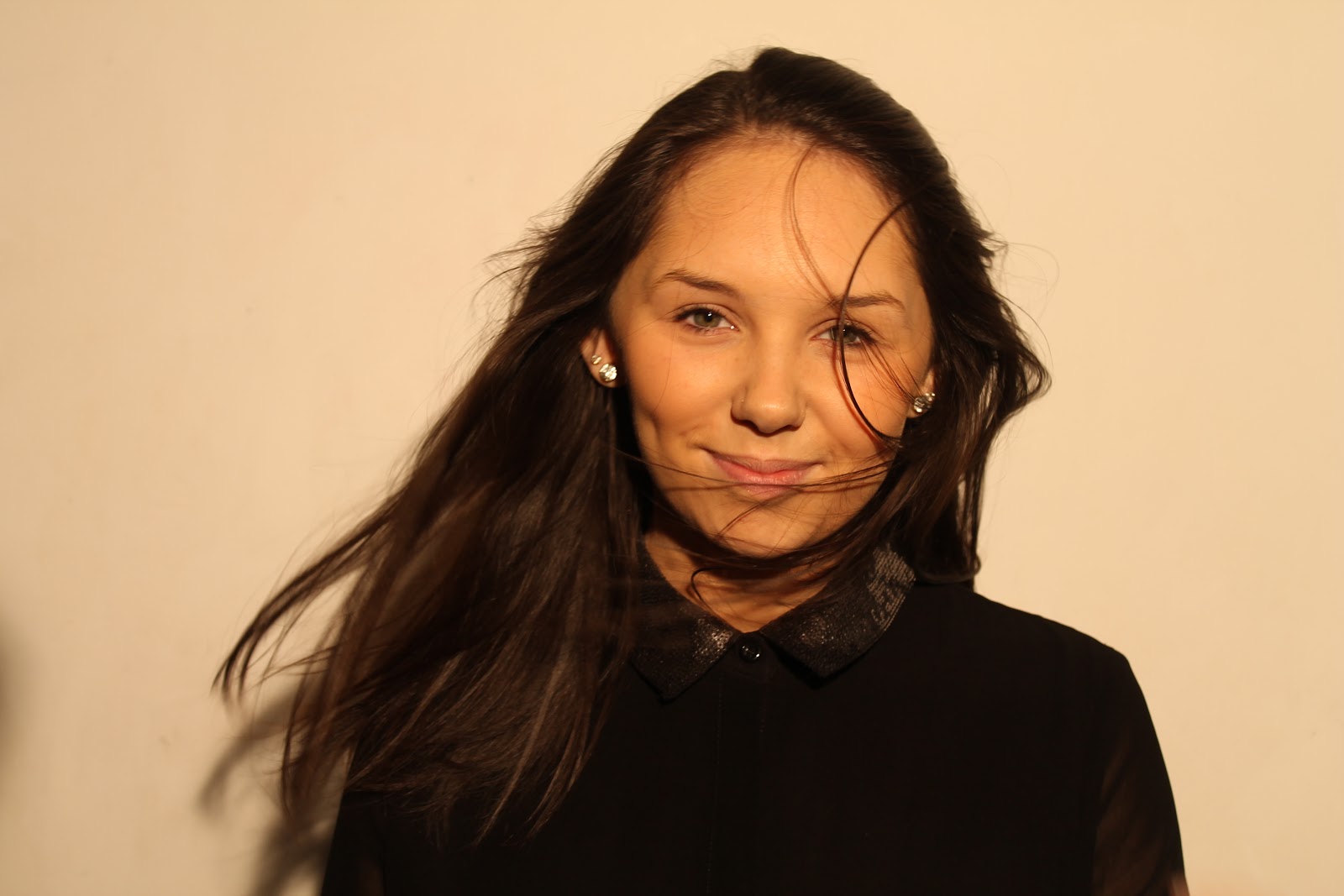
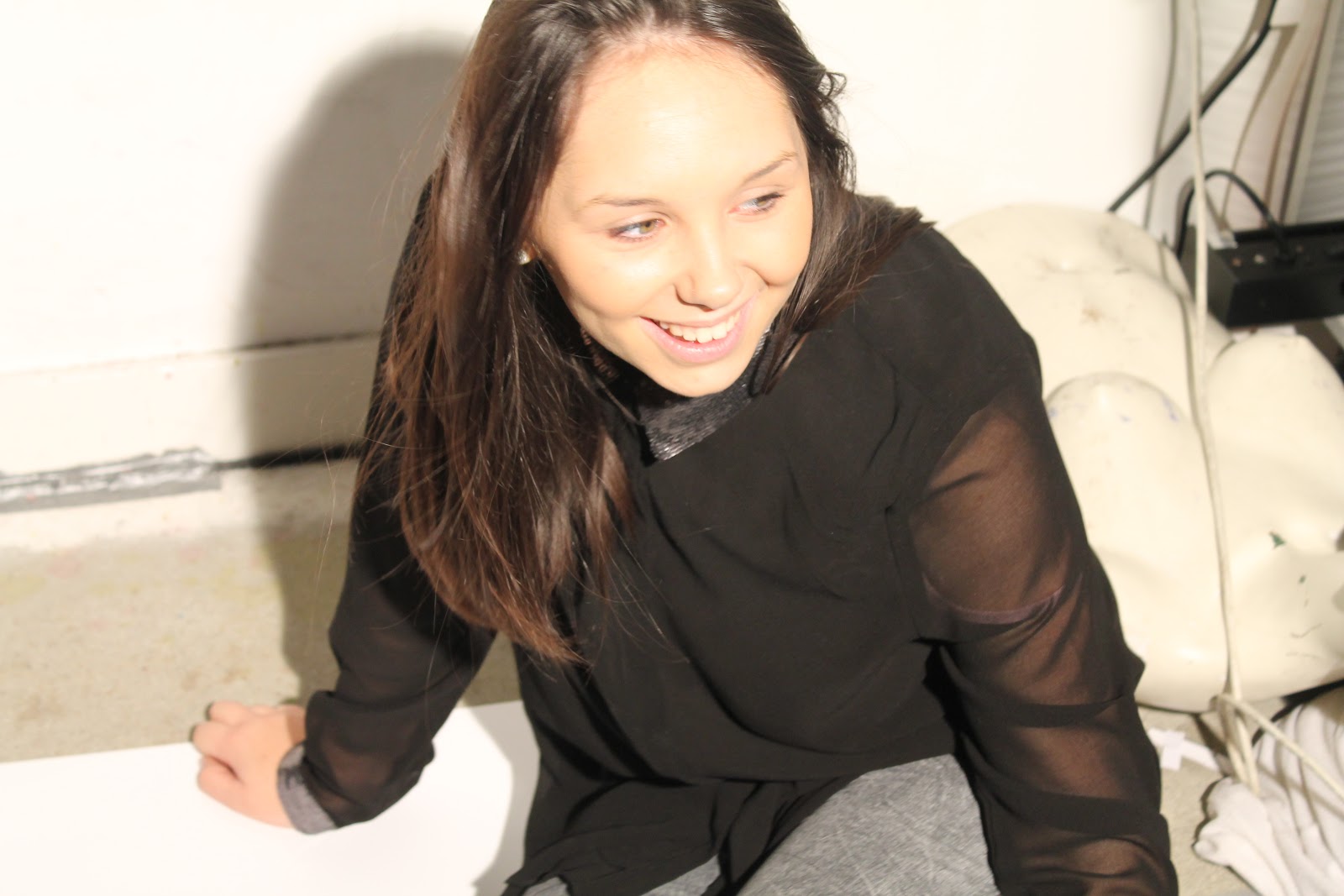
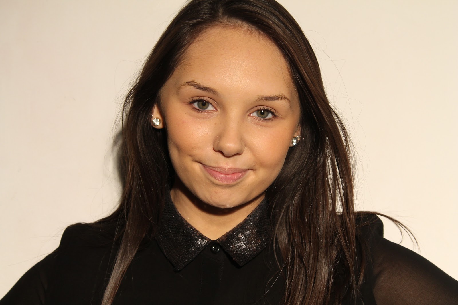
For our second day of filming we went to Lee Valley, we thought this would be a great place to film due to the open naturistic space provided and overall we were able to get great shots that suited the vision for our music video to Eliza Doolittle 'Skinny genes'. To summerise the day on a whole we didnt have any issues we had to face that jepordised our plans but our only obsticle we had to overcome was the fact that where we origionaly wanted to film in lea valley dogs were not aloud in that particular park area and Lyah had brought her dog especially to do those scenes, but we quickly came up with alternative locations near the desired area. We used props (a masquerade mask and lyah's dog) to feature in the video and differenciate the shots from each other, also we used different camera angles and shots such as, high angle shot, medium shots, close up, and shots from a side view.